

In what could easily be described as Baroque and Roll, Selfridges went for all-out decadence but in a strict palette of white and silver. I love the cheeky skull that made its way into the display.
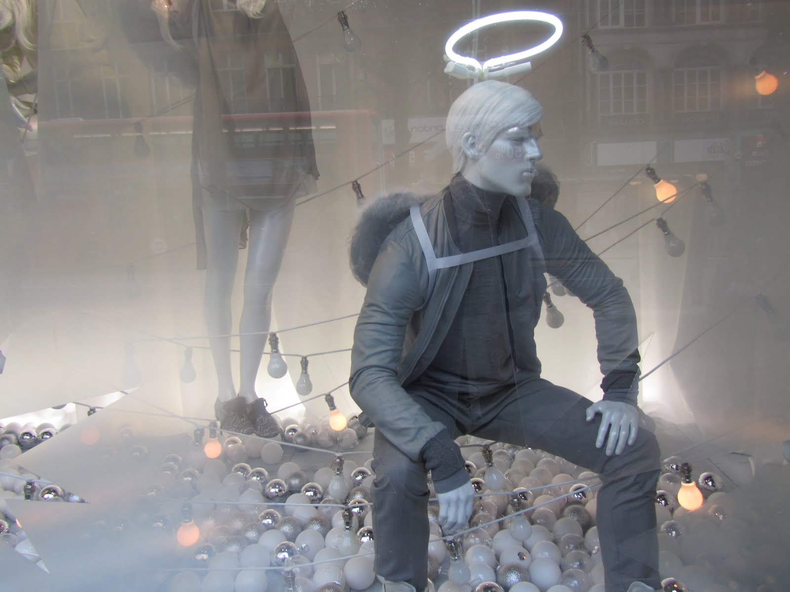
Mannequins showed a lot of uber-modern minimalist fashion, without distracting patterns. These pieces did the talking by themselves.

Against a backdrop of whitewashed wooden planks and giant ribbon decorations, the scene was set.

The Blackberry tree got me interested. This was a simple but effective piece of product placement and it's much nicer to look at than an advert or a slogan.

Homeware also got in on the act, with these laddered shelves catching my eye.

At Liberty the windows were definitely fantastical, but with an underlying craft element that was very British. The baubles in cages are already a feature at our house, and it's nice to see window displays that take on elements of reality as well.

Eveningwear gets a look-in with the moon taking centre stage
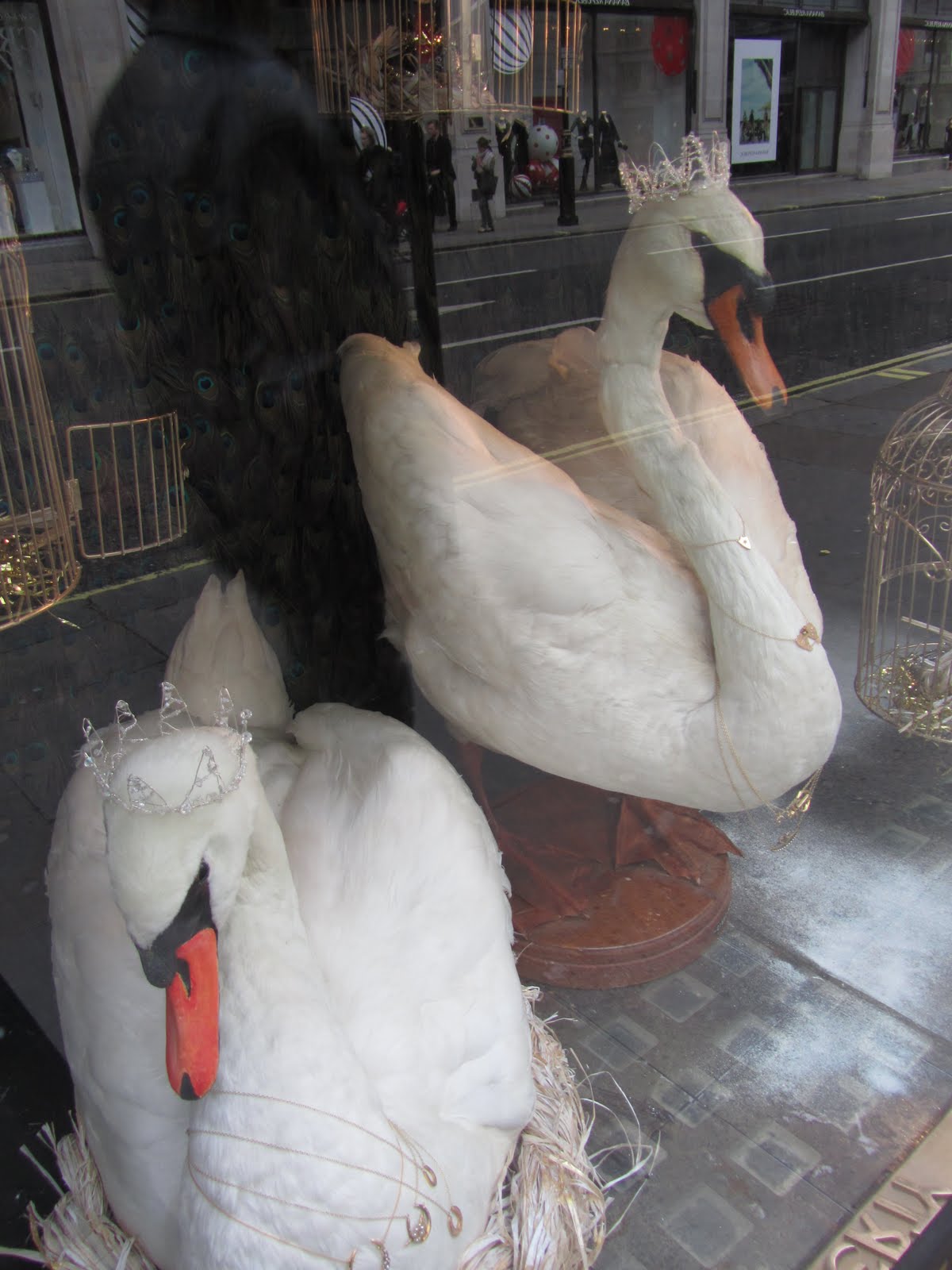
Seven swans a swimming, as the carol goes... you can see how the theme took hold in this window.

Mannequins looked languid and seemed to drape themselves over the products.

The theme really drew together all of the corresponding windows and it didn't feel detached from the spirit of Liberty as a department store.
Could I pick a favourite?
It's a tough one. I love the starkness of Selfridges, but I also keep coming back to the scene setting at Liberty. If I was pushed to decide then I'd say Liberty, as the traditional aspect really appealed to me, and it was a very welcoming piece of visual merchandising.
It's a tough one. I love the starkness of Selfridges, but I also keep coming back to the scene setting at Liberty. If I was pushed to decide then I'd say Liberty, as the traditional aspect really appealed to me, and it was a very welcoming piece of visual merchandising.
No comments:
Post a Comment